
Design Problem
The York Civic Trust was established. As part of their mission, they have installed more than 100 plaques throughout the city to commemorate significant places and spaces or influential figures or groups associated with York (https://yorkcivictrust.co.uk/heritage/civic-trust-plaques/).
Our group has been assigned the task of designing an application tailored for both local residents and tourists, enabling them to delve into the city’s history and discover the buildings, places, and individuals honoured by these plaques. The application is expected to include the following three functionalities allowing the users to:
1. Search a list of plaques and display their location
2. Read through directions between their current location and a selected plaque
3. Find the record of which plaques they have been to and display the timeline of their visits
In addition, our group is required to design one additional component of functionality for users that has emerged from our user requirements gathering work. The additional functionality should be clearly linked to our user requirements work, justified and described in detail.
Team

Browse dozens of templates. Click, duplicate, customize.
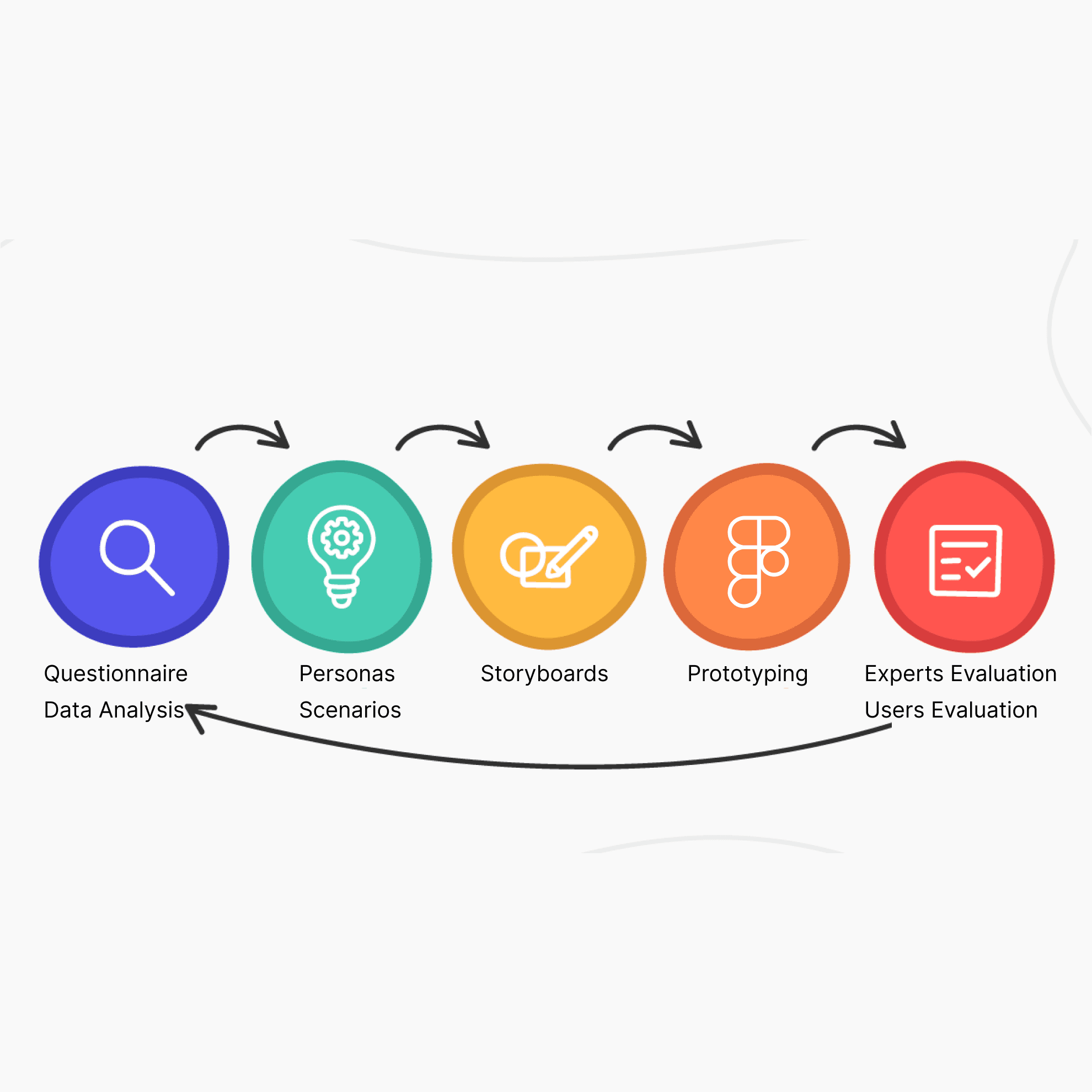
A questionnaire allowed us to efficiently gather data from users who were not co-located and allowed non-synchronous data collection.
In total, 49 responses to the questionnaire were used in our analysis. Most respondents were younger adults; the average age was 25.4 years, ranging from 18 to 56. There was a well-balanced gender split of respondents between male and female. Most responses were from current students, with those not currently in education generally in full-time employment. A slim majority of 58% were fluent in another language than English. Of the 28 multi-lingual respondents, 16 (57.1%) felt they would need a translation feature in an app, which is 33% of the total respondents. The digital skills of respondents were mixed, with the majority describing themselves as fairly skilled.
Components of functionality
Search and Navigation
The most used method to find historical and cultural sites is search engines, such as Google, though a significant number also use non-digital methods, such as guidebooks.
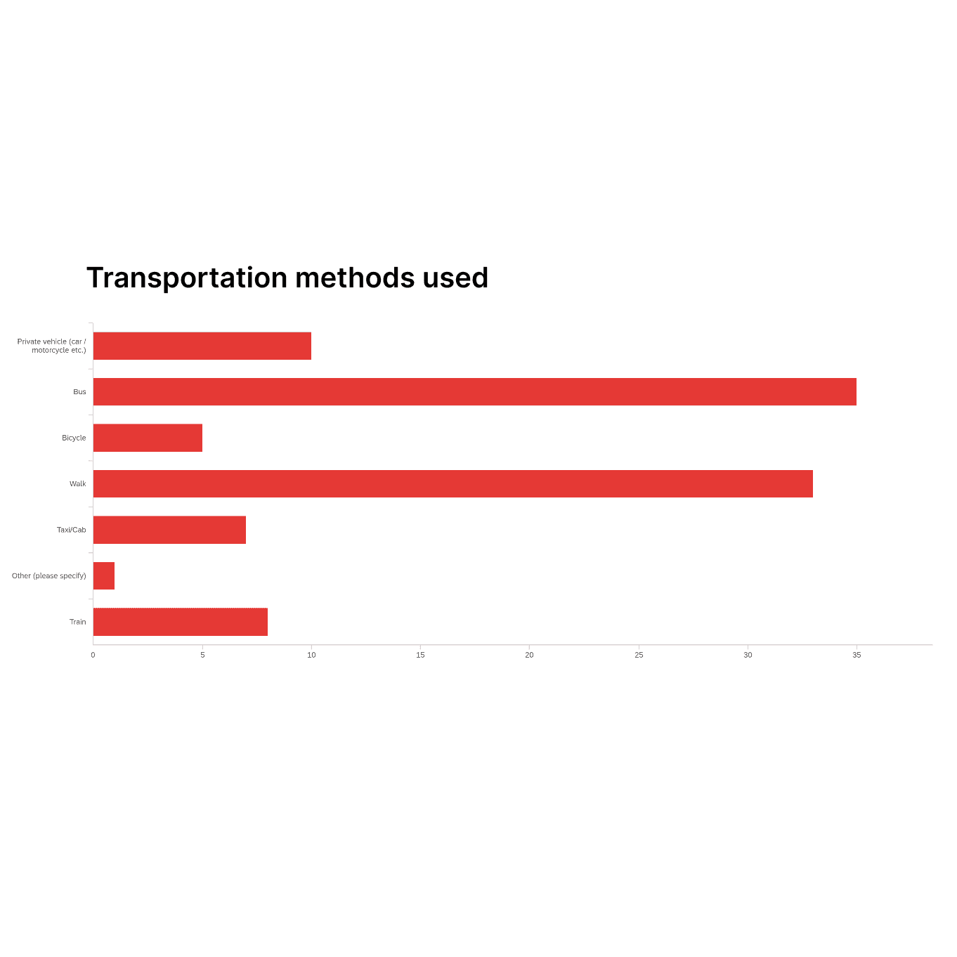
Users' most used transportation methods were busses (35%) and walking (33%).
Record and Additional Function
The majority (71%) of users currently keep track of the places they visit.
The most frequent methods they use are photographs and location tracking on mapping websites. Members of the tourist user group expressed a higher preference (67%) to share where they have visited than residents (54%).
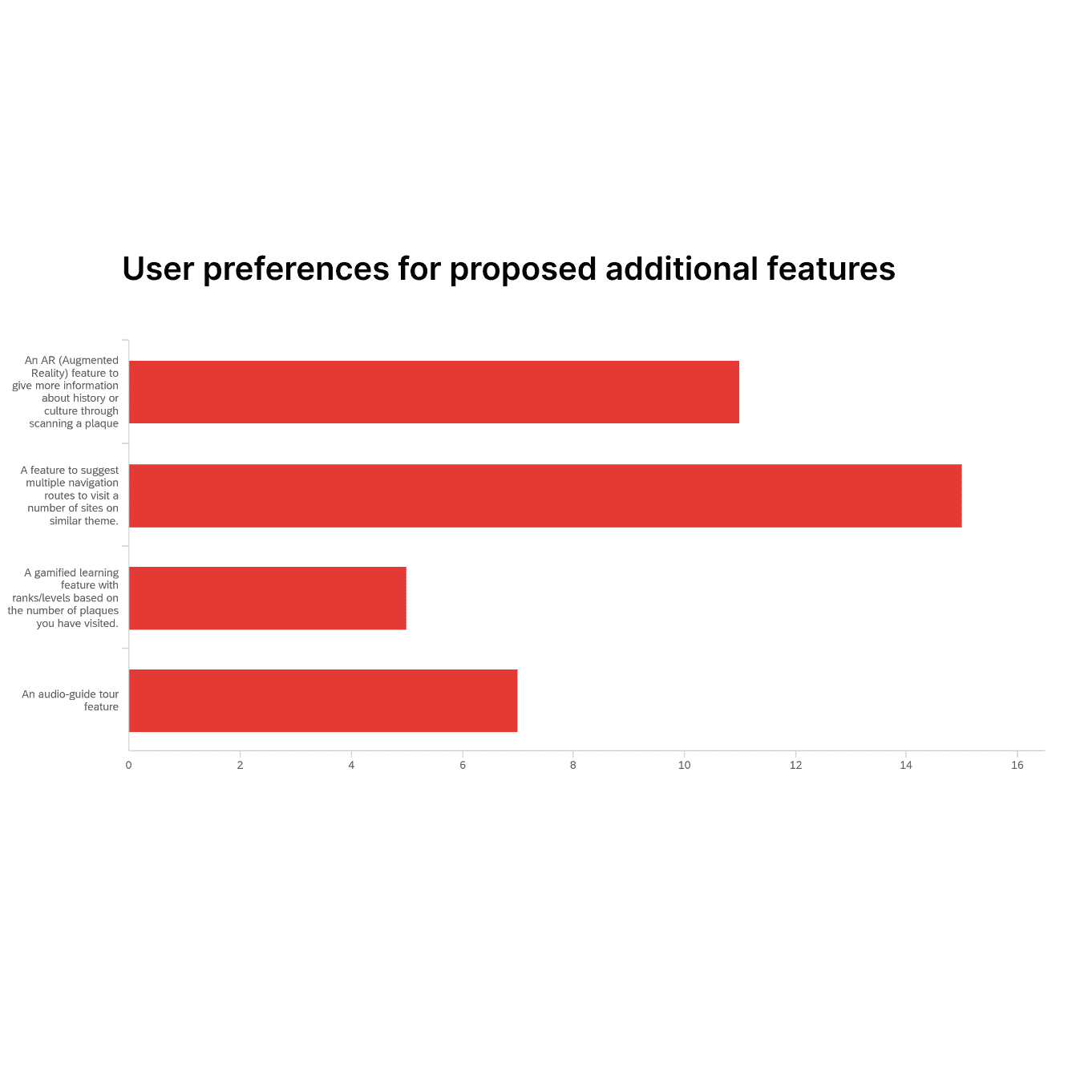
The most preferred functionality was themed navigation routes (39%), AR integration (29%), and an audio-tour guide (21%).
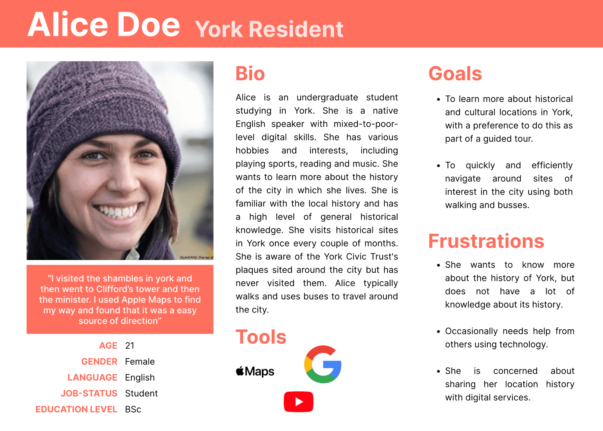
The Alice persona was based on the resident user group in the data collection and broadly the findings presented in our data analysis. The quote used was taken directly from user data in question 10. Her first goal is justified using data collected in Question 12, as 77% of residents said they were either “very” or “fairly” interested in the history and culture of York. The preference for this being conducted as part of a tour is supported by question 29, as this was our users’ most preferred proposed functionality. Our prototype could support this functionality by implementing this functionality as our additional feature. Her second goal is justified by question 24 in our data collection, as buses and walking were by far the most used transport modalities of respondents. Our prototype could support this goal by including walking and public transit integration in our map feature.
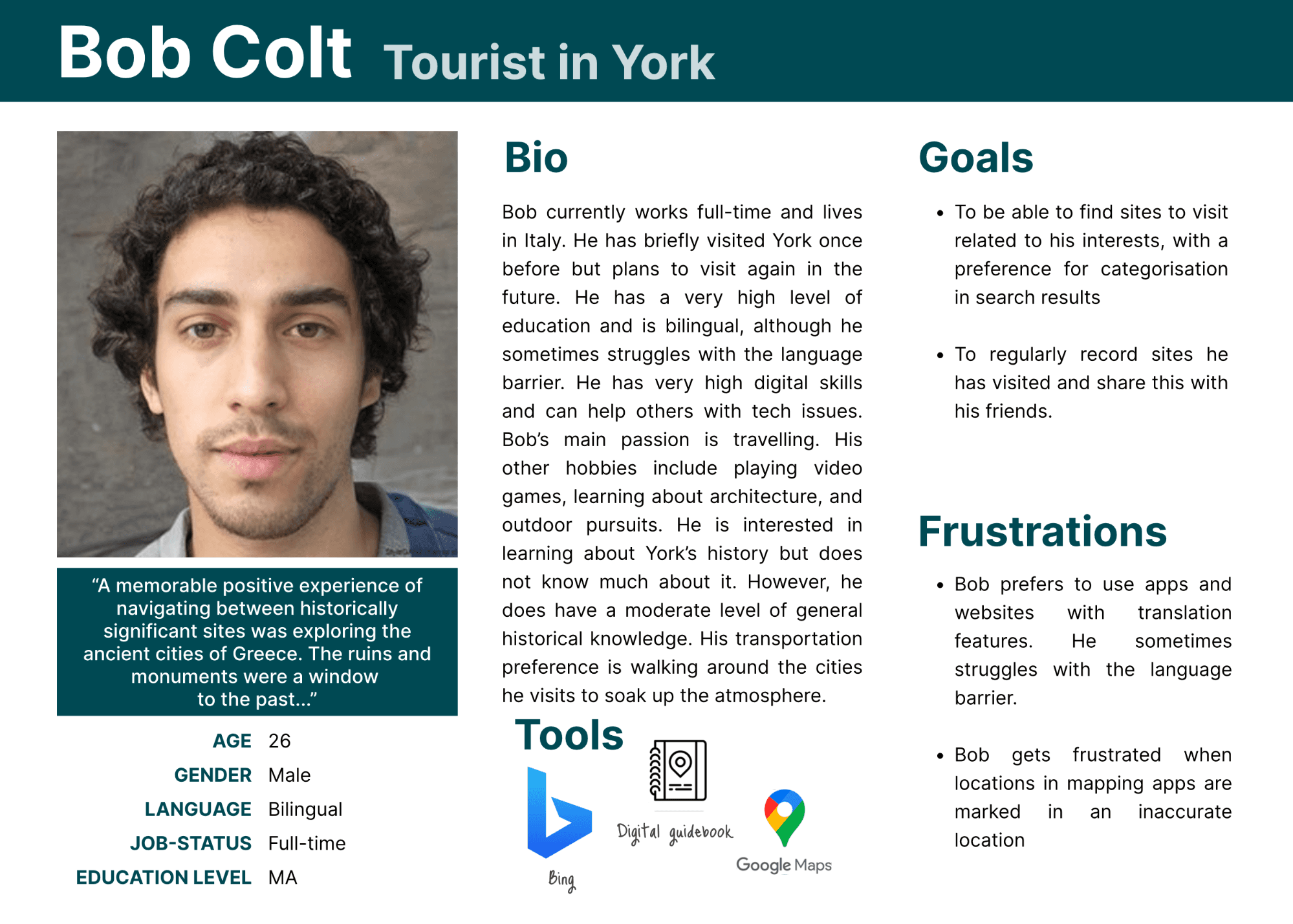
The Bob persona was based on the resident user group in the data collection and broadly the findings presented in our data analysis. The quote used was taken directly from user data in question 10. His first goal is justified using qualitative data in question 16, as a frequent code was user preference for categorisation in search results. Our prototype could support this modality by implementing this modality in the search function. His second goal is justified by question 28 in our data collection as 67% of tourists. Our prototype could support this goal by including a share option as part of the record function.
As-is Scenario
Bob, a 26-year-old tourist with advanced digital skills, explores York during his UK trip. Intrigued by York Minster, he searches for historical sites using a mapping app. Discovering York Civic Trust's plaques initiative, he faces challenges due to inaccurate locations and a lack of categorization. Frustrated, he misses out on some medieval architecture sites. Limited information in his second language and poor planning options sour his otherwise enjoyable visit. Disappointed by unreadable plaques, he wishes for more details on the mapped sites. After the visit, Bob wants to update friends with site details, finding it exhausting to share manually. He seeks an easier way to share his explored locations while taking a break.
To-be Scenario
Bob, a 26-year-old tourist with advanced digital skills, explores York for historic sites. Facing a language barrier, he discovers the York Civic Trust app, guiding him to plaques and figures commemorating significant places. Using the map and search functions, Bob finds detailed and accurate information, especially on mediaeval architecture. The app supports his native language, with an augmented reality feature for instant translations. Bob appreciates reading historical details and viewing images. At the end of the day, he shares a comprehensive travel record with friends. Satisfied, Bob praises the app's contribution to his enjoyable exploration of York's historic architecture.
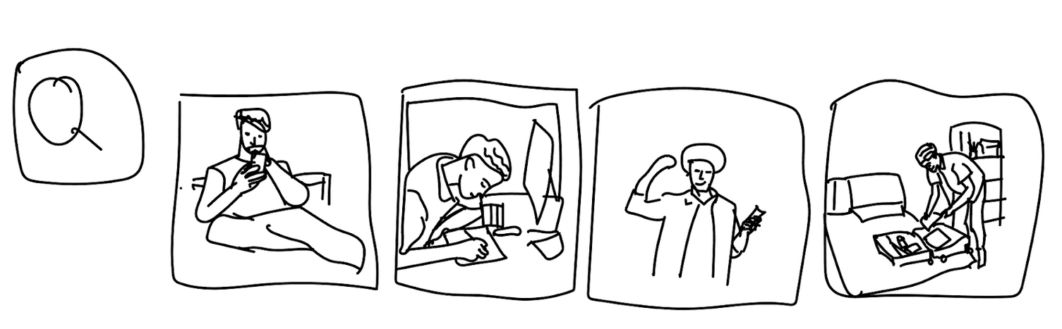
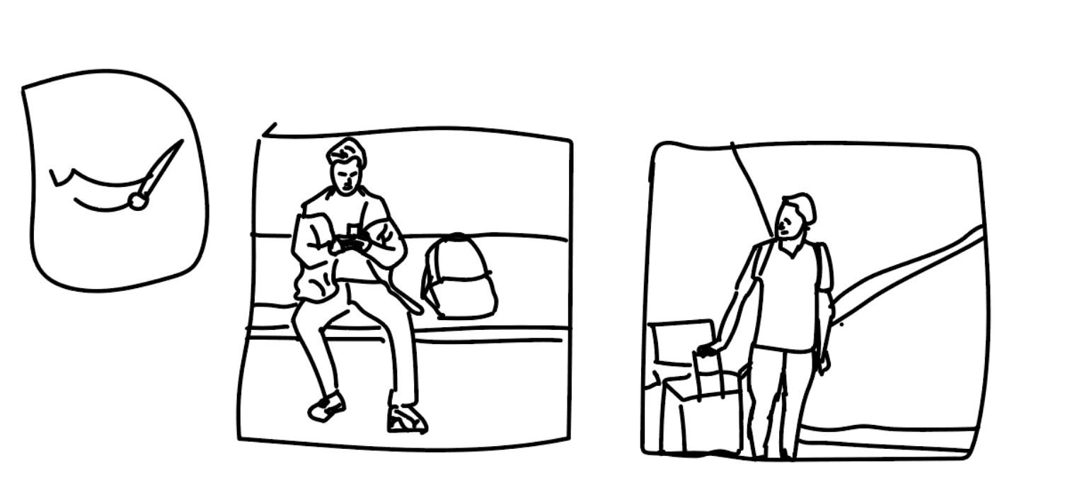
Search Function: In this storyboard, Bob is searching for more details on the plaques he wants to visit. He notes down this information and is pleased with the quality of the search results in the app. He leaves his hotel to go explore.
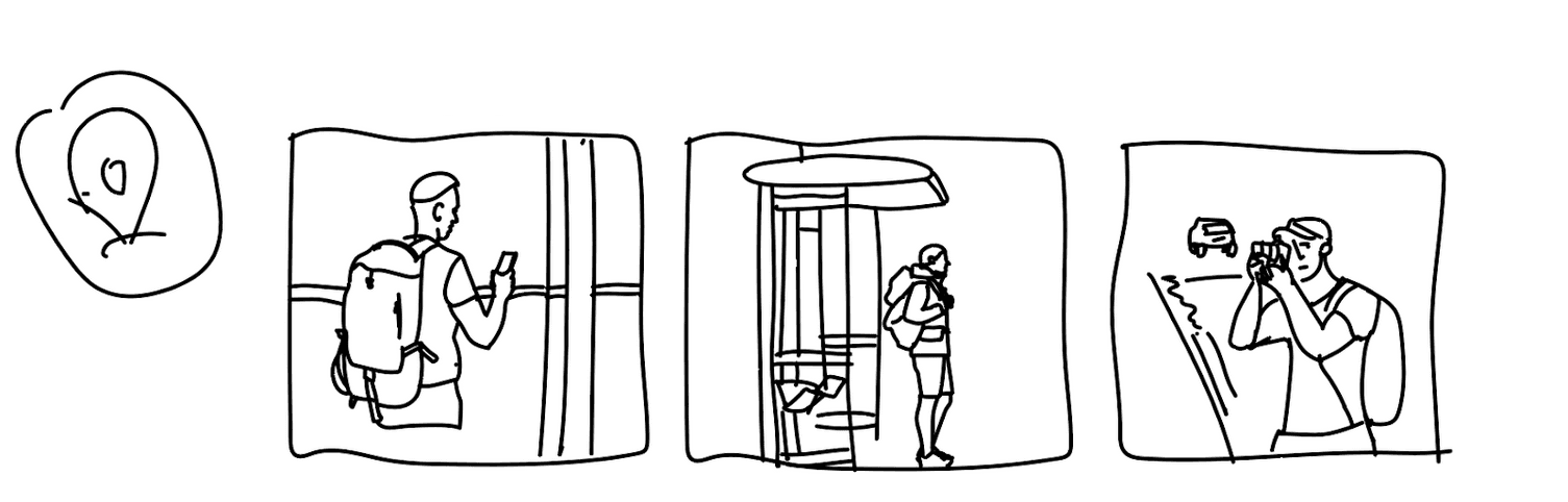
Navigation Function: In this storyboard, Bob is exploring the streets of York. He uses the app's navigation feature to travel via public transit to a historic site he wants to visit and photograph.
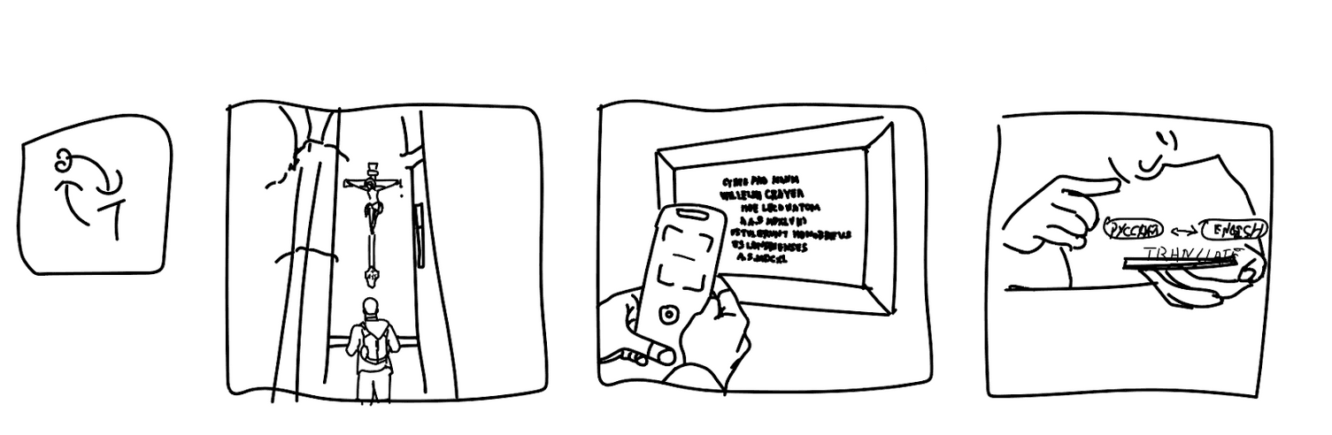
Translate Function: In this storyboard, Bob is visiting York Minster. He uses the AR scan feature to translate the text on a plaque he wants to read into his native language.
Records Function: In this storyboard, Bob is reviewing his travels around the historic sites in York using the app’s record function before he returns from his trip.
User Flow Digram
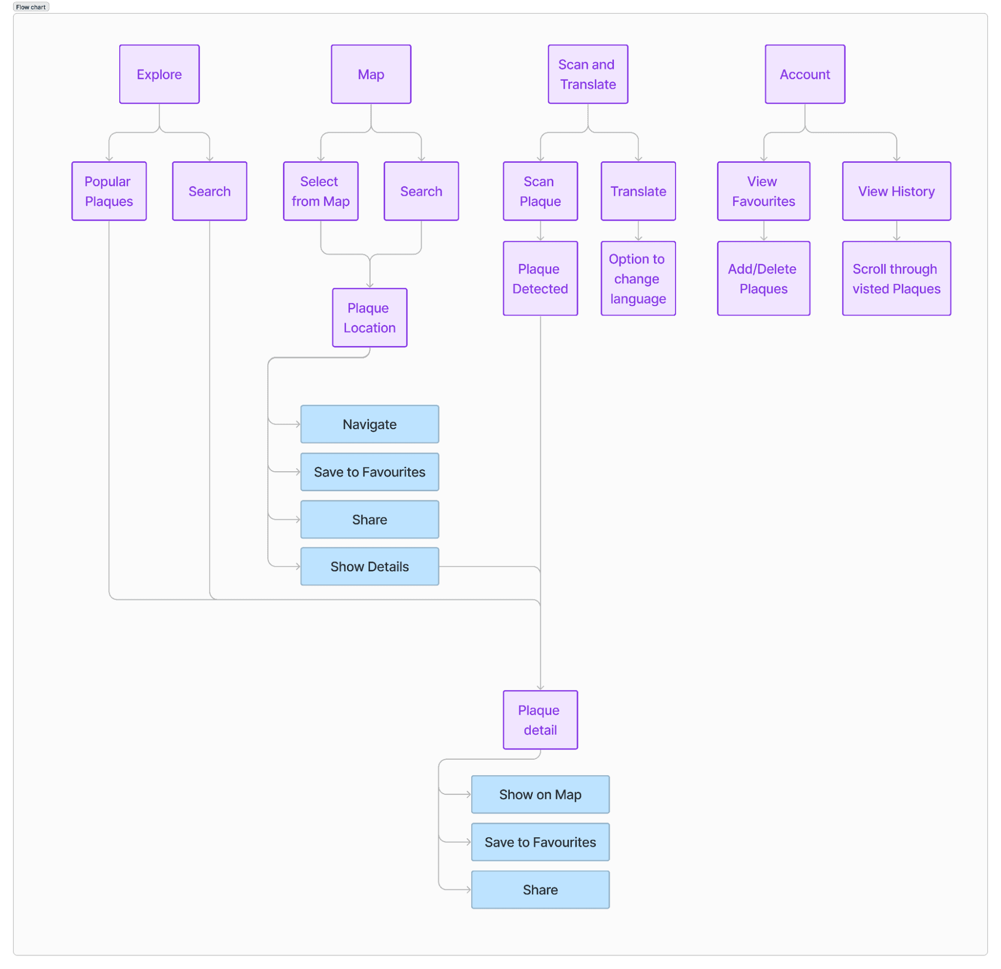
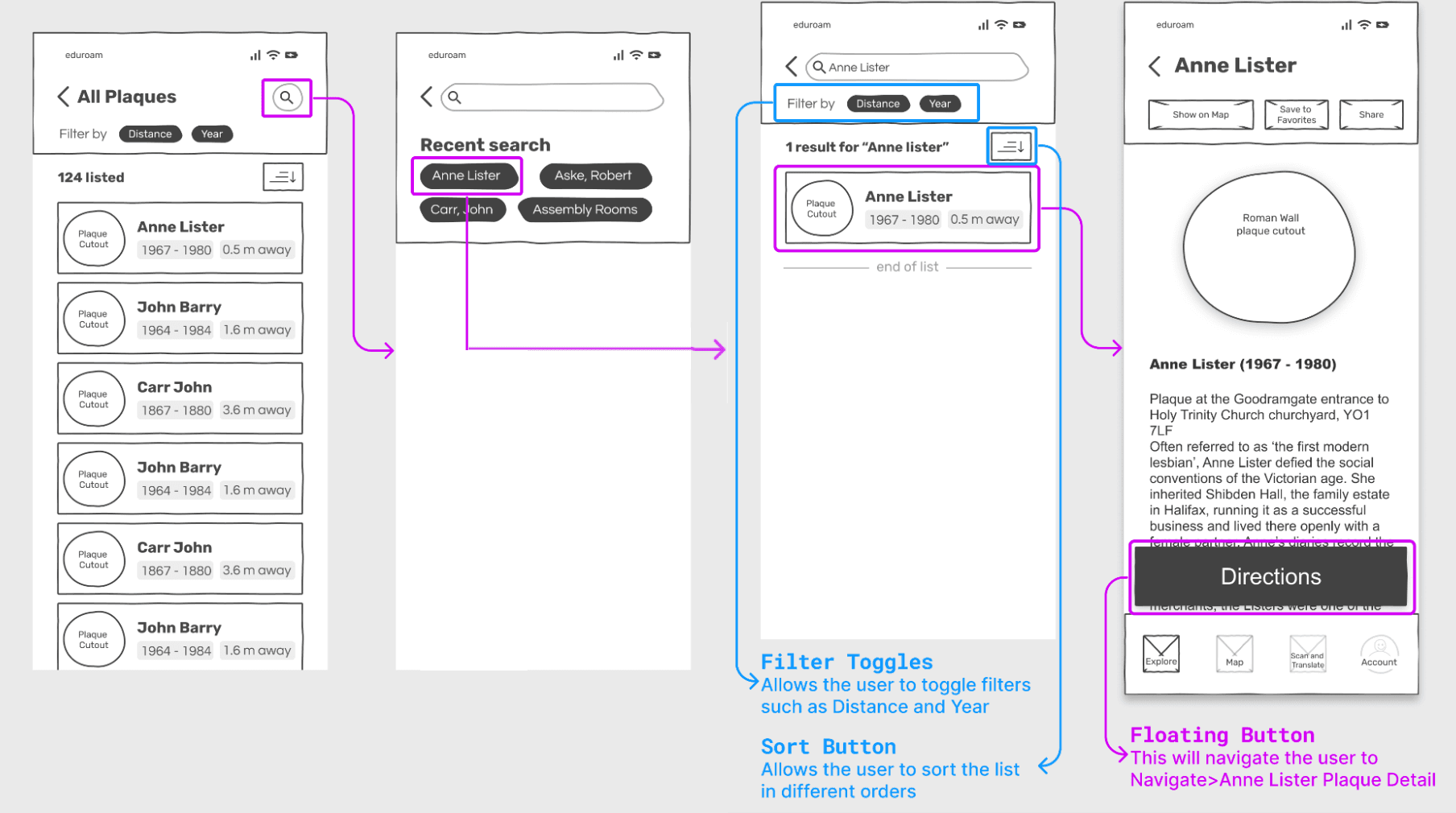
Search and List Function: This feature was implemented on the Explore page of the prototype, which is its landing page. It provided users with an intuitive experience based on interaction design conventions that user groups would be familiar with. Search functionality is a core feature of our app, so displaying it prominently in the prototype is crucial. Also on this page is a list of all plaques both ordered by distance from the user, and randomly.
The search bar is presented at the top of the screen as it is a prominent location often identified in eye-tracking studies as one of the areas users are first drawn to on a page. An example of a typical mobile heatmap is shown in Figure 13. It was also designed to follow Norman's design principle of visibility, [5] as it was accompanied by a search icon and the text “search for plaques”, which prominent signifier.
After users enter a search query, they are presented with the interaction flow described in the Figure 14 diagram. At the top of the page, users are presented with their recent searches. This is based on Tog’s principle of “Efficiency of the User: Look at the user’s productivity, not the computer’s.” [3]
One of Bob’s user goals was to utilise categories in the search. This was based on our data collection. One user who expressed this preference mentioned:
“If I were to use a dedicated app to search these plaques, I would probably like to see categories which I could filter through to see figures I would be interested in.I would also like some sort of randomise button so I can explore York's history. Maybe some sort of check off system would be helpful too so I can see which plaques I have already seen.”
To implement categorised searches in our prototype, we included filter toggles, allowing users to sort plaques by distance, age, and historical significance.
The title/name of a plaque is displayed at the top of a result in a large, weighted typeface. This is to fulfil the relevant user need which was identified in our data gathering. As name/title was the most frequent code, users responded to question 17, which asked what they would like to see first in the search results.
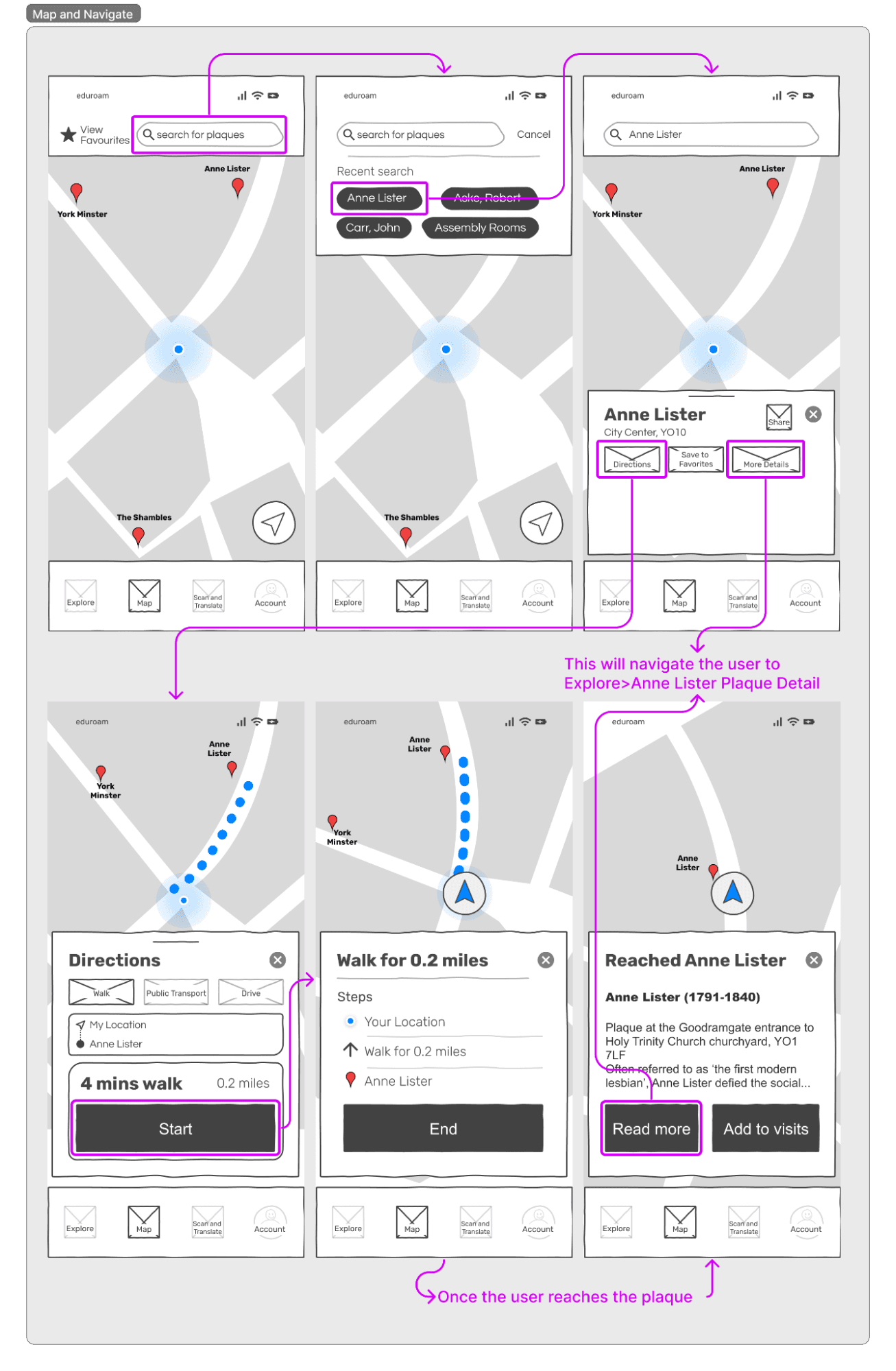
Navigation Function: In the data gathered in the questionnaire users’ three most popular methods of transportation were walking, busses, and private vehicles. The navigation component provides route guidance tailored to each of these modes, complete with
estimated travel times to their respective destinations. This decision aligns with Nielsen and Molich’s design principle of consistency. [2] By providing consistent navigation cues, users can more accurately predict and plan their journey. This design choice is grounded in the idea that users find it easier to understand and manage their schedules when presented with a familiar and predictable interface.
Moreover, our decision to mimic the functionality of popular mapping applications like Google Maps is informed by the design principle of "Cater to universal usability" proposed by Shneiderman and Plaisant.[4] This emphasizes the importance of creating designs that are universally accessible and user-friendly. By aligning with established navigation patterns, we cater to the expectations and habits of users, as evidenced by the preferences of questionnaire participants, who have relied on similar navigation tools in their past experiences. Upon reaching users destination, they have the option to delve deeper into information about the plaque or add it to their visit history, providing a comprehensive and user-friendly experience.
Points of interest are clearly indicated on the map using a pin icon with its title displayed below. This fulfils the relevant need identified in our data gathering, as 96% of users wanted to see relevant points of interest on the map. Route distance and an approximate journey time were included in the prototype as these were identified as common metrics presented to users in live mapping tools which we looked into during our ideation. We have therefore followed the H. Petrie and C. Power heuristic to "follow conventions for interaction".[1]
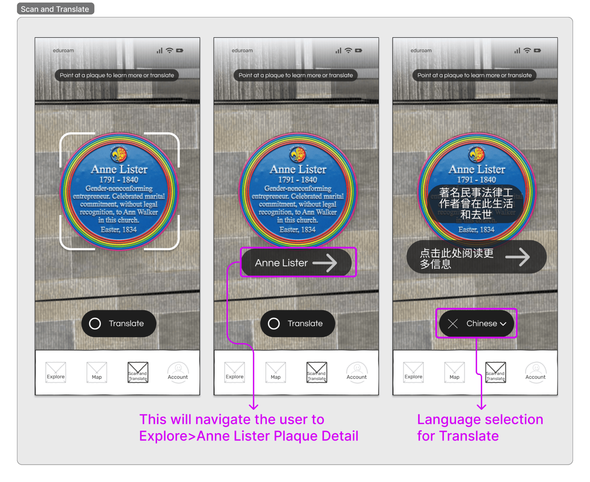
Translate Function: Translate functionality was one of our three user needs identified from our data-gathering process. Difficulties with language barriers were also one of Bob’s frustrations in his persona. In question 6, 57% of multi-lingual users said they would require a translation feature. This need is especially desired in the “tourist” user group as they are more likely to speak multiple languages.
The integration of Augmented Reality (AR) for translation assistance is substantiated by our data-gathering process. Notably, it emerged as the second most requested additional functionality in response to question 29. We have implemented this feature in alignment with Nielsen and Molich's design principle of "User control and freedom".[2] This principle underscores the importance of providing users with control over their interactions and freedom to navigate the application according to their preferences. By incorporating AR for translation assistance, we empower users with a valuable tool while adhering to the design principle that prioritizes user autonomy and flexibility.
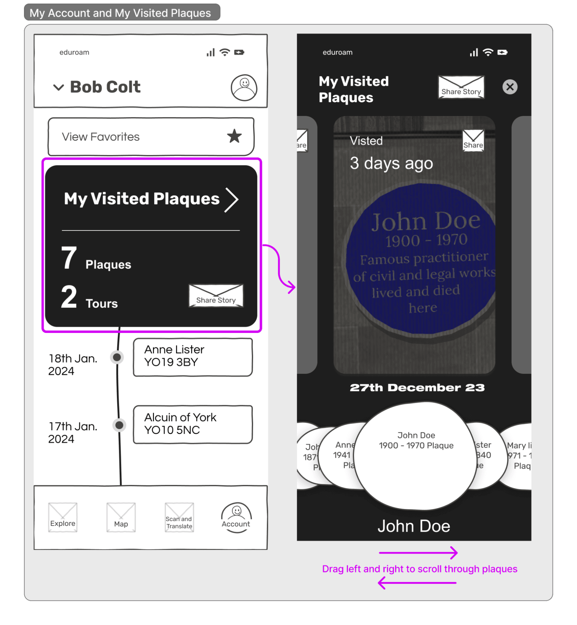
Records Function: The screen above is "My Visited Plaques", which links record cards and lists as a cohesive group, fostering seamless user interaction. The visual focal point is the records card, acknowledging that users navigate to the account page primarily to access and manage their collected records. Post-trip, users can efficiently organise their photos and leave notes within this dedicated space. We made this decision based on our data gathering. Both resident and tourist user groups express preferences for capturing memories through photos or notes, a sentiment echoed by 11 and 8 participants, respectively. To address these needs, a unified card format is introduced, displaying the number of visited plaques prominently. Following Tog's design principle of user efficiency, this card is intentionally sizable, facilitating straightforward visibility. Aesthetic considerations are also important, ensuring a visually appealing layout,[3] and facilitating emotional design.
Consistency and standards, as advocated by Nielsen and Molich, underpin the entire prototype. Uniform patterns across the system, encompassing margins, icons, colours, font size, and layout, enhance user familiarity and ease of navigation. [4] This adherence to a standardised design language contributes to a cohesive and intuitive user interface. The chronological arrangement of the timeline route adopts a Flashback structure, placing the latest entries at the top. For users inclined to share their entire journey, a dedicated icon on the "Visited Plaques Card" simplifies the process. If users prefer sharing specific plaques, a corresponding icon on each plaque-oriented card ensures a user-friendly experience. The decision to incorporate the share icon aligns with user preferences in the data gathering, where 29 out of 51 participants expressed a desire to share their plaque records with friends. It also was described in our personas as one of Bob’s goals.
In essence, the design principles of anticipation, efficiency, aesthetics, and consistency guide the creation of a user-centric account page that seamlessly integrates historical records, facilitates intuitive sharing options, and satisfies user goals.
Methodology
Collaborative Heuristic Evaluation (CHE) was used to evaluate the prototype. The heuristics followed were Petrie and Power (2012). [1] CHE was chosen as a method as we wanted to stimulate group discussion to uncover a wide range of design problems. Usability experts consisting of Utkarsh Babbar, Nanni Liu, Minmin Xu, Miles Ogden, and Akhil Thanarajah evaluated the prototype to improve the application's interactive interface and identify usability issues for an optimal interactive experience. Minmin was assigned the driver, and Miles was the scribe. The evaluation was conducted remotely over Zoom, with ratings recorded in a shared spreadsheet, with separate tabs for each expert to support anonymity. After CHE, we identified 16 design problems from the app prototype. They ranged in severity from 1.0 to 3.2 using the Molich & Nielsen, 1990 Severity rating scale. [2]
Results
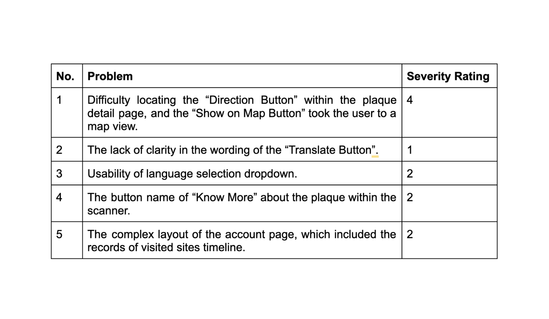
The top five design problems based on severity scale ratings are detailed below. A list of the other design problems identified is in the Appendix (pp 41–42).
Severity 3.2: Buttons for AR translation are confusing
In the AR translation function, the button to select the translation language is placed above the unlabeled "scan" button. Users may be unsure which button to press to get more information about the plaque. It was detailed as violating Petrie and Power's heuristic 9: "How and why" and 10: "Clear labels and instructions". This is because the design should provide clear explanations about how interactivity works and clear labels for all elements of interactivity. A screenshot is to the left.
Severity 3.2: The bottom navigation bar does not include an indicate translation feature
The navigation bar at the bottom of the app only shows a "scan" but does not make it clear that this modality is also used for translation. This impacted the visibility of the system to the user and was also detailed as violating heuristic 9.
Severity 2.6: The navigation page does not show information about the remaining journey time
When a user is in the process of a journey to a Plaque, as part of the mapping function, distance information is provided, but the remaining time is not shown. This is unlike the route planning page before a user starts a journey. This affects the user's ability to track their journey and is information a typical user would expect. This violated heuristic 17: "Provide the interactive functionality users will need and expect".
Severity 2.4: Two methods of viewing records of visited plaques
There is potential for user confusion on the access page: two different interactive elements are displayed on the same screen to access a record of which plaques have been visited. Opening "My Visit History" brings up a scrollable pop-up of recent plaques ordered by date visited, while "Recently visited" is an interactive, horizontally scrollable element displaying the same information. While this issue does not interfere with the app's core functionality, it could confuse users who initially think they offer different interaction modalities. This violated heuristic 11, "Avoid duplication/excessive effort by users". A screenshot is to the left.
Terminology of the 'Favourites' feature
There is no feedback provided to the user when they add a plaque to their favourites; therefore, they do not know if it has been added successfully. The explicit confirmation of elements during interface interaction was violated, and a severity rating of 2.2 was assigned. This violated heuristic 13: "Provide feedback on user actions and system progress".
Re-design
The two problems with the highest severity rating involved the AR translation feature, which received a mean severity rating of 3.2. This component was, therefore, selected to undergo a redesign based on the results of the expert evaluation. To address the potential confusion over the functionality of the AR buttons, they were redesigned and relabeled, and staggered timing was implemented. The translate button would be displayed constantly, while a button offering more information would only pop up when a plaque was in the frame. This was implemented as a "Wizard of Oz" interaction in keeping with the rest of the AR features. The icon on the bottom navigation bar was renamed "Scan and Translate" to address the issue. As this is only a low-fidelity prototype, this was seen as an acceptable compromise; however, it was felt that in a higher-fidelity prototype, it could be addressed using design iconography.
User Evaluation
A task-based user evaluation was conducted to evaluate whether the prototype meets user needs, preferences, and expectations. In the initial planning phase, the team collectively decided on tasks users would complete. The tasks were selected to evaluate the app's core functionalities, considering the personas' needs and goals and storyboarding. A hybrid approach was used to collect the data. Performance measures and a think-aloud protocol were used to understand more about the user's thought process and mental model. Performance measures used were:
Number of users successfully completing the task.
Amount of time to complete the task.
Number and type of errors per task.
Number of steps it took to complete the task.
How easy or difficult did the users find the task?
How easy or difficult was it for the users to find the task?
Qualitative data was also collected from users during the think-aloud process.
A total of ten participants took part in the user evaluation. Each of the five researchers recruited one participant from the resident user group and one from the tourist user group. All our participants gave informed consent before participating in the evaluation with the Department’s ethics requirements. User evaluations were not conducted in a controlled environment, but they were carried out in a casual setting, with no distractions, where users felt comfortable. Four tasks were presented to participants as part of a scenario and ordered logically. The task content varied based on the user group the participant was a part of.
Resident user tasks:
Search for the “Anne Lister” plaque.
Get directions from “your current location” to the “Anne Lister” plaque.
Scan the “Anne Lister” plaque to read more about it.
Check for the record of the plaques you have visited so far, including the visit timeline.
Tourist user tasks:
Search “Archaeology”.
Get directions from “your current location” to the “Roman Wall” plaque.
Scan the “Roman Wall” plaque to translate it to “Chinese”.
Check for the record of the plaques that you have visited so far, including the timeline of the visit.
The results of the user evaluation show that the resident user group was unsatisfied with task 2 (Get directions from “your current location” to the “Anne Lister” plaque) as it received the lowest average satisfaction score. The tourist user group found it difficult to complete task 2 (Get directions from “your current location” to the “Roman Wall” plaque), with only 3 out of 5 successfully completing the task. Detailed results of the performance measures can be found in the Appendix (pp 42).
We assessed the severity of identified usability problems found from the performance measures and think-aloud results based on the Molich & Nielsen severity rating,[2] considering factors such as frequency, impact, and persistence. This scale ranges from 1, a cosmetic problem, to 4, a catastrophic problem.
Usability problem 1 received the highest severity rating due to its significant impact found in the user evaluation data. Also, obtaining directions to specific plaques is a core feature of the app, so addressing this problem will benefit all users.
The redesign above was made to address the problem of users being unable to locate the "Directions Button." In this revised design, the button is positioned as a floating element at the bottom centre of the screen. This placement transforms it into a prominent action button within the page to ensure it is one of the first interactive elements users notice.
The redesign above offered an alternative approach to obtaining directions to a plaque. In the previous version, when the user clicked on the "Show on Map Button," it only displayed a map view. However, a new modal overlay element was introduced in the redesigned version, featuring various options, including "Directions."
Reference
[1] H. Petrie and C. Power, “What do users really care about?”, 2012. doi: 10.1145/2207676.2208363.
[2] J. Nielsen and R. Molich, “Heuristic evaluation of user interfaces”, 1990. doi: 10.1145/97243.97281.
[3] B. Tognazzini, (2014, Mar 5). First Principles of Interaction Design (Revised & Expanded). AskTog. Available: https://asktog.com/atc/principles-of-interaction-design/. Accessed: Jan 16, 2024.
[4] R. Krause. (2021, Jan 10). Consistency and Standards. Nielsen Norman Group. Available: https://www.nngroup.com/articles/consistency-and-standards/. Accessed: January 16, 2024.
[5] D. A. Norman, "Visibility" in The Design of Everyday Things, MIT Press, 2013, pp, 1-9.
[6] Zuko.io, File:Mobile Website Heatmap Analysis.jpg.” Wikimedia Commons. Accessed: Jan 17, 2024. [Online]. CC BY 2.0 Deed. Available: https://commons.wikimedia.org/wiki/File:Mobile_Website_Heatmap_Analysis.jpg
[7] D. Lewandowski and Y. Kammerer, “Factors influencing viewing behaviour on search engine results pages: a review of eye-tracking research”, Behaviour & Information Technology, vol. 40, no. 14, pp. 1485–1515, 2021, doi: 10.1080/0144929x.2020.1761450.